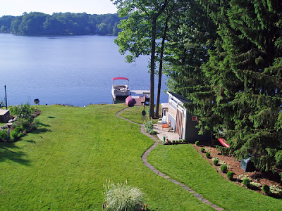
Location, location, location
 Upon hearing about our remodel/addition plans, some people are inspired to ask, either gently or incredulously: Why did you move into such a stupid house? Responding to the problems I whine about in this blog, they offer such inquiries as: Didn’t you have a house inspection before agreeing to buy this dump? And: Why didn’t you simply invest in a better house initially instead of going through all this hassle and expense now?
My long-winded response spells out our strategy to buy an affordable “view with a roof” and fix the structure later. Blah-blah-blah-modern-dream-house-blah-blah. While my goal is to be descriptive rather than defensive, it doesn’t always sound that way. Frankly, this all seemed pretty brilliant in 1998 when we started planning and in 1999 when we were house hunting. As we get gradually closer to bidding the job, I get increasingly nervous.
So, this morning, I took the photo above from our deck to remind myself that in real estate, three words matter most: location, location, location. Our view dates back more than a century. The lake was created in the 1890s for the exclusive 50-member White Meadow Fish and Game Club, which built the dam. The White Meadow Lake Property Owners Association was formed in 1948 and our population has grown from 25 families to more than 9,000 people.
Labels: Modern Architecture, Remodeling


